11.61 Scatter Plot Colour Shape Theme BW
20180603
set.seed(26439)
ds %>%
sample_n(1000) %>%
ggplot(aes(x=min_temp, y=max_temp, colour=rain_tomorrow, shape=rain_tomorrow)) +
geom_point() +
labs(x = vnames["min_temp"],
y = vnames["max_temp"],
colour = vnames["rain_tomorrow"]) +
theme_bw() +
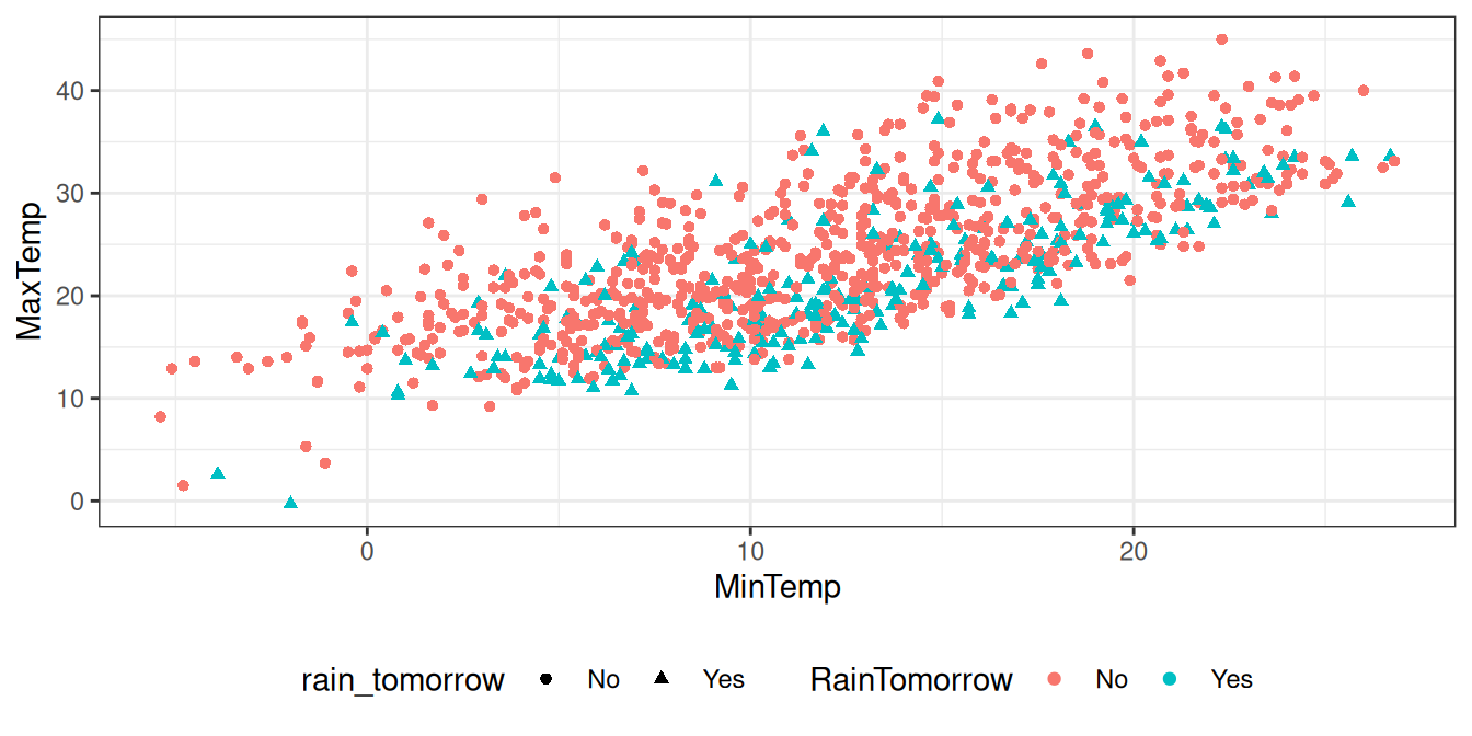
theme(legend.position="bottom")There are many circumstances where it makes sense to colour the points according to some scheme. For example, in a predictive modelling context the colour might correspond to the prediction made (yes or no). For a cluster analysis the colour might represent the cluster each point is allocated to.
A key variable of interest in the rattle::weatherAUS dataset is
rain_tomorrow. By colouring the dots according to the
rain_tomorrow we may begin to see relationships in the data.
The colour is added simply by specifying a further aesthetic,
colour=rain_tomorrow. Different values of the variable
rain_tomorrow will then be coloured differently.
Your donation will support ongoing availability and give you access to the PDF version of this book. Desktop Survival Guides include Data Science, GNU/Linux, and MLHub. Books available on Amazon include Data Mining with Rattle and Essentials of Data Science. Popular open source software includes rattle, wajig, and mlhub. Hosted by Togaware, a pioneer of free and open source software since 1984. Copyright © 1995-2022 Graham.Williams@togaware.com Creative Commons Attribution-ShareAlike 4.0