11.5 Bar Chart
20200427
## Warning: <ggplot> %+% x was deprecated in ggplot2 4.0.0.
## ℹ Please use <ggplot> + x instead.
## This warning is displayed once every 8 hours.
## Call `lifecycle::last_lifecycle_warnings()` to see where this warning was generated.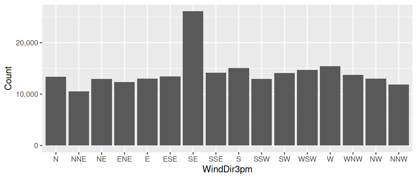
ds %>%
  ggplot(aes(x=wind_dir_3pm)) +
  geom_bar() +
  scale_y_continuous(labels=comma) +
  labs(x=vnames["wind_dir_3pm"], y="Count")
A common and simple plot is the bar chart which displays
bars with a height that corresponds to the number of observations
having that value of the variable displayed on the x-axis. We use
ggplot2::geom_bar() to add a bar chart layer to a plot. Only
an x-axis aesthetic is required using ggplot2::aes() with the
x= option. The y-axis is automatically computed.
In our example we pipe the dataset on to ggplot2::ggplot(),
specifying the x-axis as the categoric variable
wind_dir_3pm (the x-axis). The count is automatically
determined from the dataset by ggplot2::geom_bar() which then
adds the layer of bars to the plot.
The y-ticks use commas with the ggplot2::scale_continuous()
function using the labels=``comma option. It is crucial that
for large numbers commas separate the thousands, so that the reader is
able to easily read the number. There can be catastrophic outcomes
from a misreading of numbers.
The x-axis and y-axis labels are set using ggplot2::labs()
with the x= and y= options. The x-label uses the
original dataset’s variable name as recorded in the template variable
vname (i.e.,
WindDir3pm). The y-label is set to be
Count.
A Bar Chart displays the distribution of the values for a categoric variable, allowing us to compare the frequency of the different categories. The height of each bar represents the frequency of the value of the corresponding category.
Your donation will support ongoing availability and give you access to the PDF version of this book. Desktop Survival Guides include Data Science, GNU/Linux, and MLHub. Books available on Amazon include Data Mining with Rattle and Essentials of Data Science. Popular open source software includes rattle, wajig, and mlhub. Hosted by Togaware, a pioneer of free and open source software since 1984. Copyright © 1995-2022 Graham.Williams@togaware.com Creative Commons Attribution-ShareAlike 4.0