11.19 Bar Chart Supplied Values
20200427
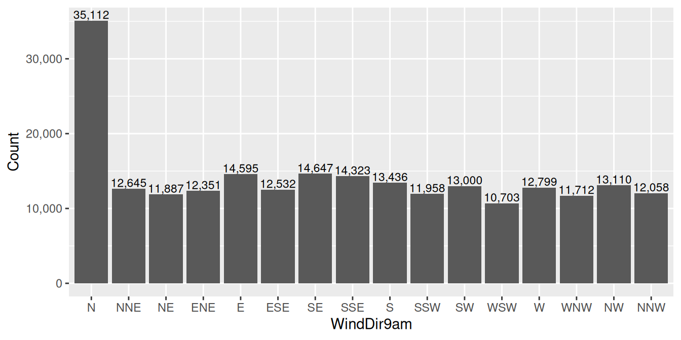
ds %>%
  count(wind_dir_9am) %>%
  ggplot(aes(x=wind_dir_9am, y=n)) +
  geom_col() +
  geom_text(aes(label=comma(n)), vjust=-0.2, size=3) +
  scale_y_continuous(labels=comma) +
  labs(x=vnames["wind_dir_9am"], y="Count")
If the values of the bars are supplied in the source dataset (the y-axis) ggplot2::geom_col() is used. In this example we manually count the frequency of each wind direction in the dataset prior to invoking ggplot2::ggplot(). This modified dataset is then passed on to ggplot2::ggplot() to display. Of course, it would be better in this specific example to let ggplot2::geom_bar() do the work itself as in Section 11.21.
Your donation will support ongoing availability and give you access to the PDF version of this book. Desktop Survival Guides include Data Science, GNU/Linux, and MLHub. Books available on Amazon include Data Mining with Rattle and Essentials of Data Science. Popular open source software includes rattle, wajig, and mlhub. Hosted by Togaware, a pioneer of free and open source software since 1984. Copyright © 1995-2022 Graham.Williams@togaware.com Creative Commons Attribution-ShareAlike 4.0