11.9 Bar Chart Faceted Background
20200823
ds %>%
sample_frac(0.1) %T>%
{assign("norain", . %>% select(-rain_tomorrow), 1)} %>%
mutate(rain_tomorrow=factor(rain_tomorrow,
levels=(rain_tomorrow %>% unique() %>%
sort() %>% rev()))) %>%
ggplot(aes(x=wind_dir_3pm, fill=wind_dir_3pm)) +
geom_bar(data=norain, fill="gray", alpha=0.5) +
geom_bar() +
facet_wrap(~ rain_tomorrow) +
labs(x=vnames["wind_dir_3pm"], y="Count") +
scale_y_continuous(labels=comma) +
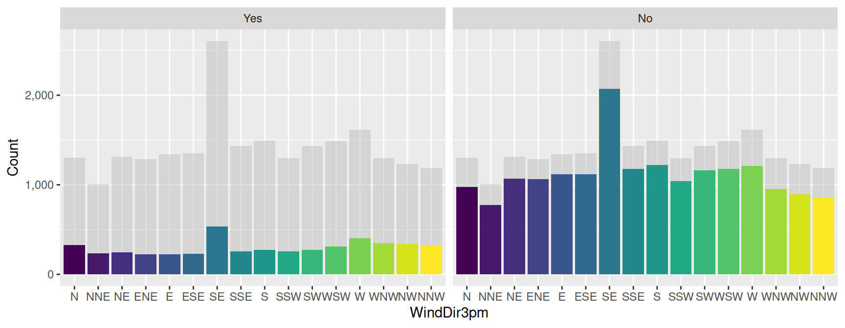
theme(legend.position="none")Using a faceted bar chart we can compare the individual charts with the global chart shown as a gray background.
Take a 10% sample. Remove the target column and save. Swap the order of No/Yes in the target column. Plot the wind direction. Add a grey layer with the non-target variable dataset. Add normal bar layer. Facet. Labels will have commas. Turn the legend off.
See https://drsimonj.svbtle.com/plotting-background-data-for-groups-with-ggplot2.
Your donation will support ongoing availability and give you access to the PDF version of this book. Desktop Survival Guides include Data Science, GNU/Linux, and MLHub. Books available on Amazon include Data Mining with Rattle and Essentials of Data Science. Popular open source software includes rattle, wajig, and mlhub. Hosted by Togaware, a pioneer of free and open source software since 1984. Copyright © 1995-2022 Graham.Williams@togaware.com Creative Commons Attribution-ShareAlike 4.0