11.62 Scatter Plot Colour Choice
20200608
ds %>%
sample_n(1000) %>%
ggplot(aes(x=min_temp, y=max_temp, colour=rain_tomorrow)) +
geom_point() +
scale_colour_brewer(palette="Paired") +
labs(x = vnames["min_temp"],
y = vnames["max_temp"],
colour = vnames["rain_tomorrow"]) +
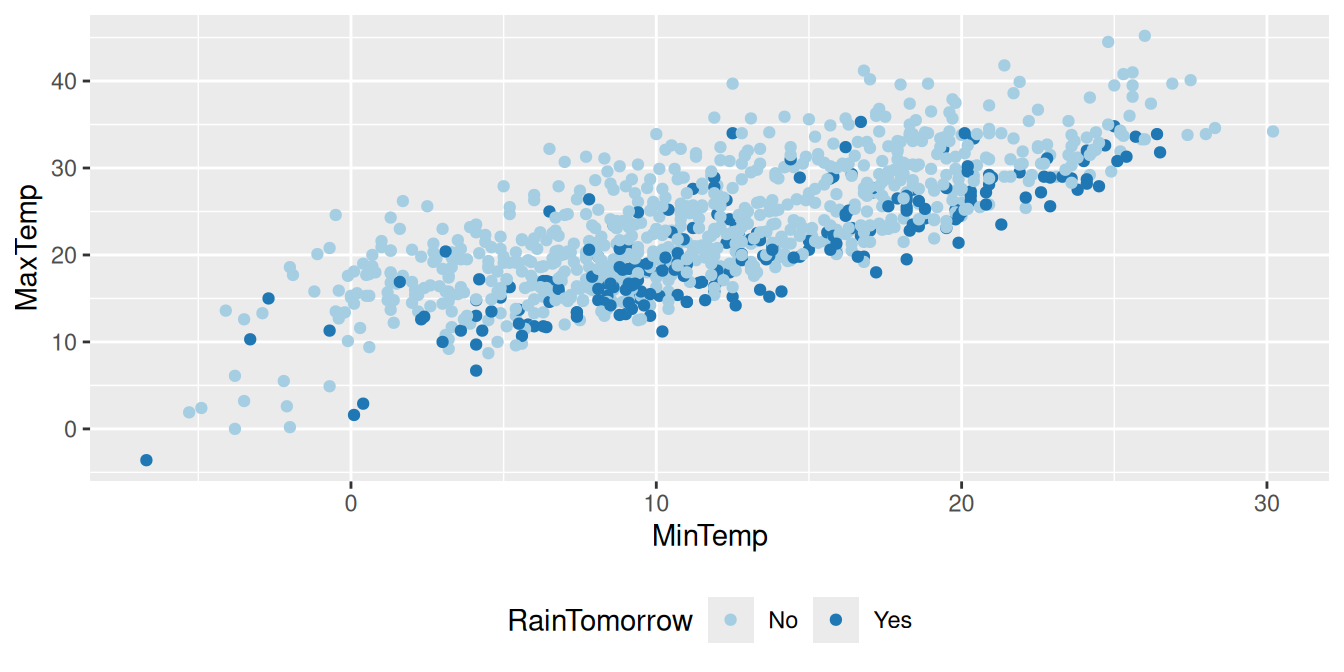
theme(legend.position="bottom")With different choices of colour different patterns may be
visible. Here the value of interest for the variable of interest,
rain_tomorrow, is highlighted with a darker colour. We can observe,
but would want to also statistically test, that generally it rains
tomorrow for lower values of the maimum temperature today.
The random sample of 1,000 rows is generated using
dplyr::sample_n() and is then piped through to
ggplot2::ggplot(). The function argument identifies the aesthetics
of the plot so that x= associates the variable
min_temp with the x-axis and y= associates the
variable max_temp with the y-axis.
In addition the colour= option provides a mechanism to
distinguish between days where the observation rain_tomorrow is
Yex and where it is No. A colour palette can be chosen using
ggplot2::scale_colour_brewer().
A graphical layer is added to the plot consisting of \((x,y)\) points coloured appropriately. The function ggplot2::geom_point() achieves this.
The original variable names stored as vnames are used to
label the plot using ggplot2::labs(). The original names will
make more sens to the reader than our chosen normalised names.
Your donation will support ongoing availability and give you access to the PDF version of this book. Desktop Survival Guides include Data Science, GNU/Linux, and MLHub. Books available on Amazon include Data Mining with Rattle and Essentials of Data Science. Popular open source software includes rattle, wajig, and mlhub. Hosted by Togaware, a pioneer of free and open source software since 1984. Copyright © 1995-2022 Graham.Williams@togaware.com Creative Commons Attribution-ShareAlike 4.0