11.42 Labels Rotated
20200428
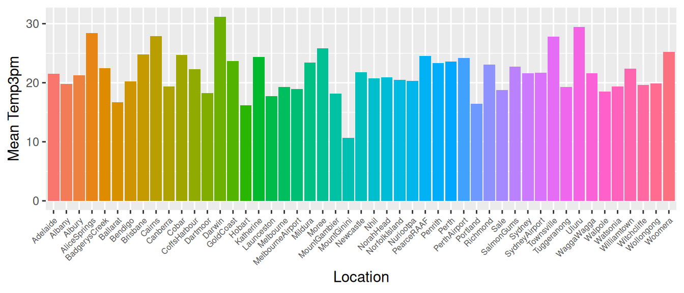
ds %>%
  ggplot(aes(x=location, y=temp_3pm, fill=location)) +
  stat_summary(fun="mean", geom="bar") +
  labs(x=vnames["location"],
       y=glue('Mean {vnames["temp_3pm"]}')) +
  theme(legend.position="none",
        axis.text.x=element_text(angle=45, hjust=1, size=6))
When a bar chart has many bars and non-trivial labels then it is
useful to rotate the labels. Here we plot the mean temperature at 3pm
for each location in the dataset. Without rotating the x-axis labels
(the locations) the x-axis will be blighted with much overlapping.
Labels can be rotated using a ggplot2::theme() option of
axis.text.x= with angle=$45^\circ$.
Use hjust=1 to align the labels appropriately.
Your donation will support ongoing availability and give you access to the PDF version of this book. Desktop Survival Guides include Data Science, GNU/Linux, and MLHub. Books available on Amazon include Data Mining with Rattle and Essentials of Data Science. Popular open source software includes rattle, wajig, and mlhub. Hosted by Togaware, a pioneer of free and open source software since 1984. Copyright © 1995-2022 Graham.Williams@togaware.com Creative Commons Attribution-ShareAlike 4.0