11.46 Line Chart Density Distribution
20200428
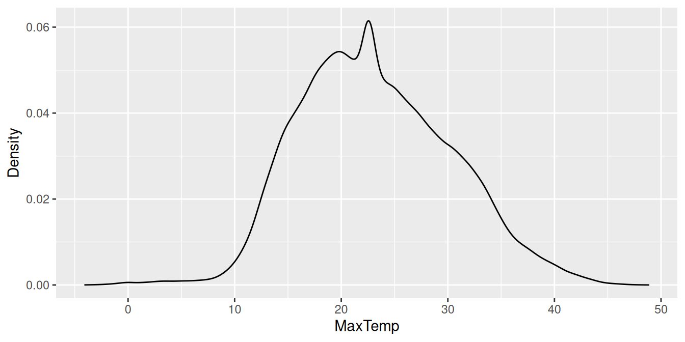
A density plot using ggplot2::geom_density() will convey the
distribution of the values of a variable. Here, for example, we can
see that max_temp has a roughly normal distribution with a
peak around the low 20’s (degrees Celsius) and fairly short tails.
Your donation will support ongoing availability and give you access to the PDF version of this book. Desktop Survival Guides include Data Science, GNU/Linux, and MLHub. Books available on Amazon include Data Mining with Rattle and Essentials of Data Science. Popular open source software includes rattle, wajig, and mlhub. Hosted by Togaware, a pioneer of free and open source software since 1984. Copyright © 1995-2022 Graham.Williams@togaware.com Creative Commons Attribution-ShareAlike 4.0