11.72 Violin Plot Faceted Location
REVIEW
## Warning: Groups with fewer than two datapoints have been dropped.
## ℹ Set `drop = FALSE` to consider such groups for position adjustment purposes.
## Groups with fewer than two datapoints have been dropped.
## ℹ Set `drop = FALSE` to consider such groups for position adjustment purposes.
## Groups with fewer than two datapoints have been dropped.
## ℹ Set `drop = FALSE` to consider such groups for position adjustment purposes.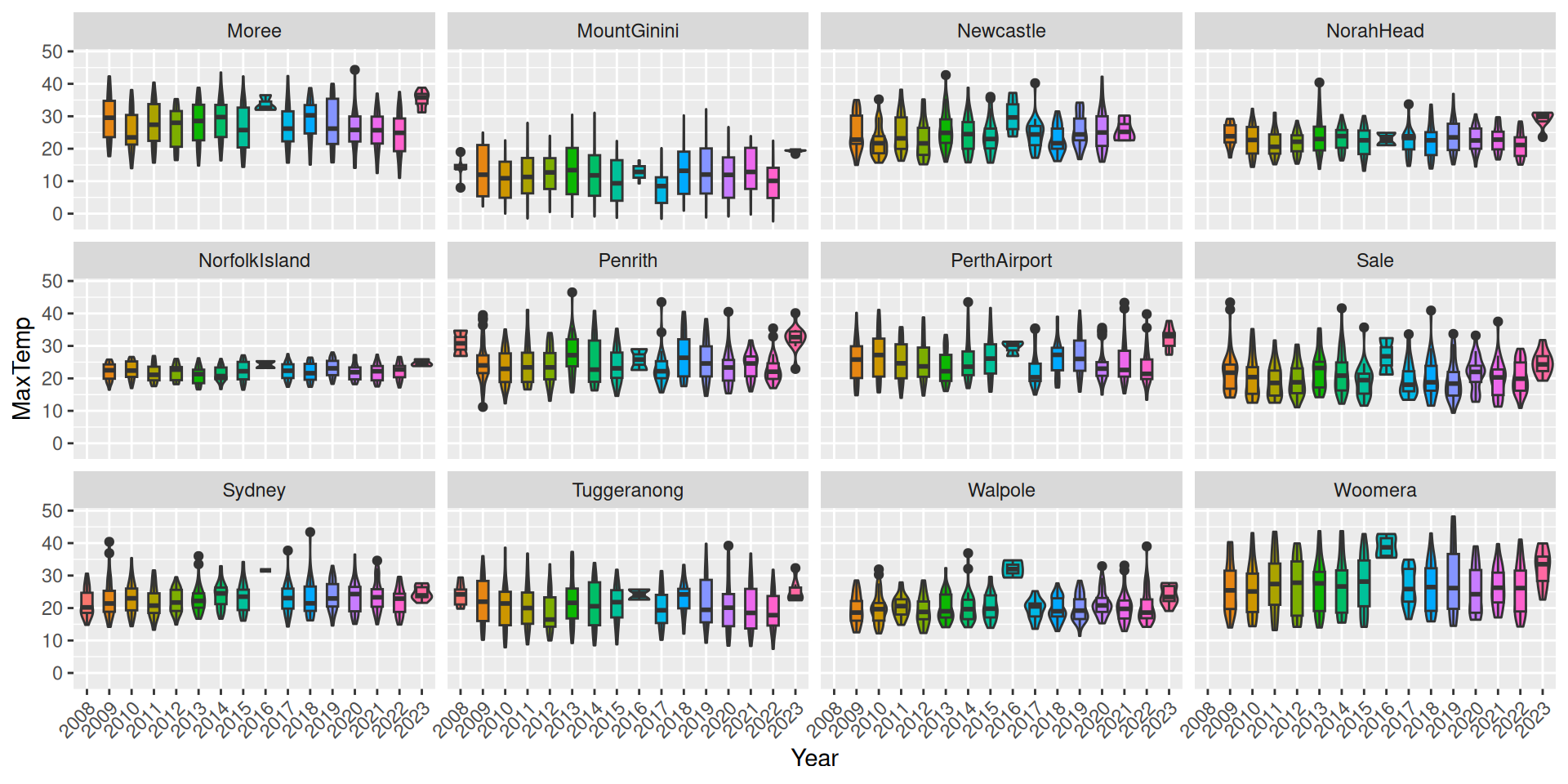
ds %>%
  mutate(year=factor(format(ds$date, "%Y"))) %>%
  filter(location %in% (ds$location %>% unique %>% sample(12))) %>%
  sample_frac(0.1) %>%
  ggplot(aes(x=year, y=max_temp, fill=year)) +
  geom_violin() +
  geom_boxplot(width=.5, position=position_dodge(width=0)) +
  theme(legend.position="none") +
  theme(axis.text.x=element_text(angle=45, hjust=1)) +
  labs(x="Year", y=vnames["max_temp"]) +
  facet_wrap(~location)
We can readily split the plot across the locations. Things get a little crowded, but we get an overall view across all of the different weather stations. Notice we also rotated the x-axis labels so that they don’t overlap.
We can immediately see one of the issues with this dataset, noting that three weather stations have fewer observations that then others.
Various other observations are also interesting. Some locations have little variation in their maximum temperatures over the years.
Your donation will support ongoing availability and give you access to the PDF version of this book. Desktop Survival Guides include Data Science, GNU/Linux, and MLHub. Books available on Amazon include Data Mining with Rattle and Essentials of Data Science. Popular open source software includes rattle, wajig, and mlhub. Hosted by Togaware, a pioneer of free and open source software since 1984. Copyright © 1995-2022 Graham.Williams@togaware.com Creative Commons Attribution-ShareAlike 4.0