11.29 Cumulative Plot
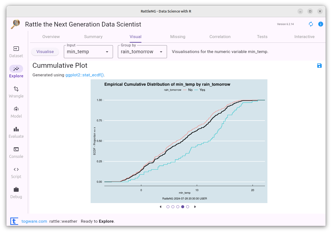
An Empirical Cumulative Distribution Function plot (or ECDF for short) provides a graphical representation of the cumulative distribution of a dataset. It shows how the data values are distributed across the range of the dataset, highlighting the proportion of observations below each value. The x-axis represents the data values from the dataset while the y-axis is the proportion of data points below a particular value of x. Such plots provide a different but interesting view of how the data is distributed, accumulative over the x range. It helps in understanding the spread and concentration of data points and can be used to compare different datasets or groups.
Your donation will support ongoing availability and give you access to the PDF version of this book. Desktop Survival Guides include Data Science, GNU/Linux, and MLHub. Books available on Amazon include Data Mining with Rattle and Essentials of Data Science. Popular open source software includes rattle, wajig, and mlhub. Hosted by Togaware, a pioneer of free and open source software since 1984. Copyright © 1995-2022 Graham.Williams@togaware.com Creative Commons Attribution-ShareAlike 4.0