11.22 Bar Chart Wide and Borders
20200428
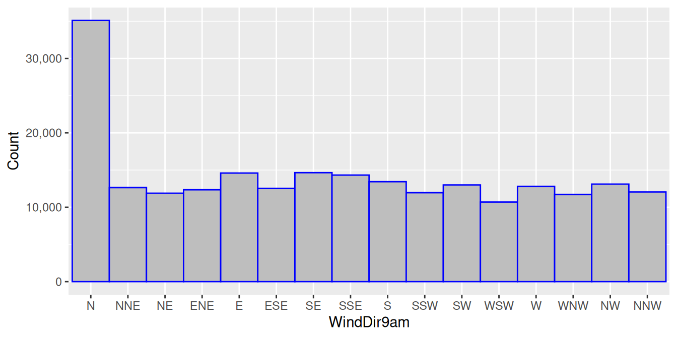
ds %>%
  ggplot(aes(wind_dir_9am)) +
  geom_bar(width=1, colour="blue", fill="grey") +
  scale_y_continuous(labels=comma) +
  labs(x=vnames["wind_dir_9am"], y="Count")
We can improve the appearance of a fat bar chart by adding, in this
case, a blue border to the bars, using colour=``"blue". By itself
that would look a bit ugly, so we also fill=``"grey" the bars with
grey rather than the default black. We can play with different colours
to achieve a pleasing and personalised result.
Your donation will support ongoing availability and give you access to the PDF version of this book. Desktop Survival Guides include Data Science, GNU/Linux, and MLHub. Books available on Amazon include Data Mining with Rattle and Essentials of Data Science. Popular open source software includes rattle, wajig, and mlhub. Hosted by Togaware, a pioneer of free and open source software since 1984. Copyright © 1995-2022 Graham.Williams@togaware.com Creative Commons Attribution-ShareAlike 4.0