11.63 Scatter Plot Smooth Gam
REVIEW
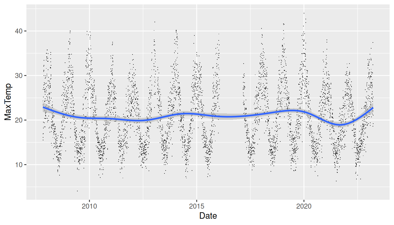
ds %>%
  filter(location=="Canberra") %>%
  ggplot(aes(x=date, y=max_temp)) +
  geom_point(shape=".") +
  geom_smooth(method="gam", formula=y~s(x, bs="cs")) +
  labs(x=vnames["date"], y=vnames["max_temp"])
This scatter plot of x=date against
y=max_temp shows a pattern of seasonality over
the dataset and a trend line over the period of the dataset.
The scatter plot is again created using ggplot2::geom_point().
Typical of scatter plots of big data there will be many overlaid
points. To reduce the impact the points are reduced to a small dot
using shape=".".
An additional layer of a smooth fitted curve, using
ggplot2::geom_smooth(), is added. The dataset has many points
and so a smoothing method recommended is
method="gam" which will automatically be chosen if
not specified but with a message to that effect. The formula specified
using formula= is also the default for
method="gam".
Your donation will support ongoing availability and give you access to the PDF version of this book. Desktop Survival Guides include Data Science, GNU/Linux, and MLHub. Books available on Amazon include Data Mining with Rattle and Essentials of Data Science. Popular open source software includes rattle, wajig, and mlhub. Hosted by Togaware, a pioneer of free and open source software since 1984. Copyright © 1995-2022 Graham.Williams@togaware.com Creative Commons Attribution-ShareAlike 4.0