11.70 Violin Plot
REVIEW
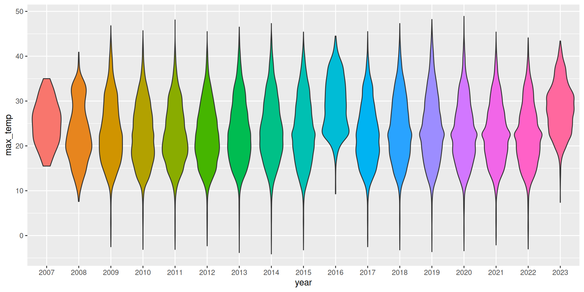
ds %>%
  mutate(year=factor(format(ds$date, "%Y"))) %>%
  ggplot(aes(x=year, y=max_temp, fill=year)) +
  geom_violin() +
  theme(legend.position="none")
A violin plot is another interesting way to present a distribution, using a shape that resembles a violin.
We again use colour to improve the visual appeal of the plot.
Your donation will support ongoing availability and give you access to the PDF version of this book. Desktop Survival Guides include Data Science, GNU/Linux, and MLHub. Books available on Amazon include Data Mining with Rattle and Essentials of Data Science. Popular open source software includes rattle, wajig, and mlhub. Hosted by Togaware, a pioneer of free and open source software since 1984. Copyright © 1995-2022 Graham.Williams@togaware.com Creative Commons Attribution-ShareAlike 4.0