11.41 Labels Removed
20200317
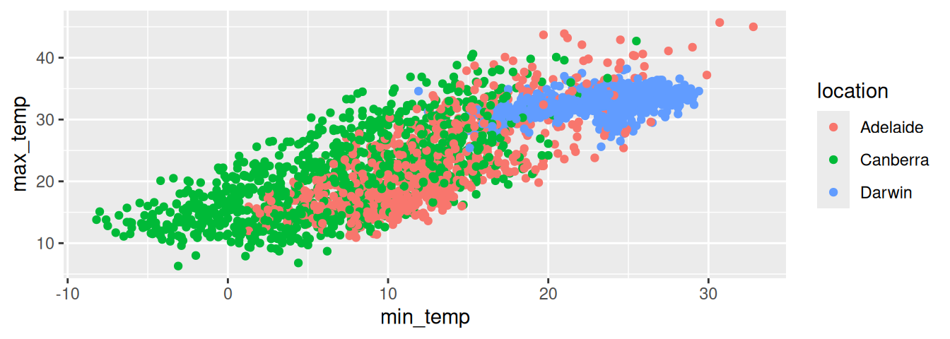
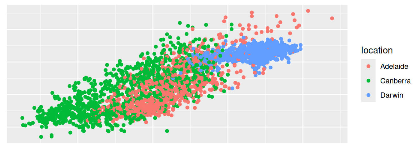
ds %>%
  subset(location %in% c("Canberra", "Adelaide", "Darwin")) %>%
  sample_frac(0.2) %>%
  ggplot(aes(min_temp, max_temp, colour=location)) +
  geom_point() +
  theme(axis.ticks.x = element_blank(),
        axis.text.x  = element_blank(),
        axis.title.x = element_blank(),
        axis.ticks.y = element_blank(),
        axis.text.y  = element_blank(),
        axis.title.y = element_blank())
The top plot has default x-axis and y-axis ticks, text, and title. To remove axis labels altogether the bottom plot adds a layer to set the axis ticks, text, and title to ggplot2::element_blank() which is used to draw nothing and to take no space within a non-data component of the plot, using the ggplot2::theme() system:
Notice the use of dplyr::sample_frac() to plot a 20% random sample of the dataset and thus the actual points plotted in the two plots above are randomly different.
Your donation will support ongoing availability and give you access to the PDF version of this book. Desktop Survival Guides include Data Science, GNU/Linux, and MLHub. Books available on Amazon include Data Mining with Rattle and Essentials of Data Science. Popular open source software includes rattle, wajig, and mlhub. Hosted by Togaware, a pioneer of free and open source software since 1984. Copyright © 1995-2022 Graham.Williams@togaware.com Creative Commons Attribution-ShareAlike 4.0