11.24 Box Plot Distributions
REVIEW
ds %>%
mutate(year=factor(format(ds$date, "%Y"))) %>%
ggplot(aes(x=year, y=max_temp, fill=year)) +
geom_boxplot(notch=TRUE) +
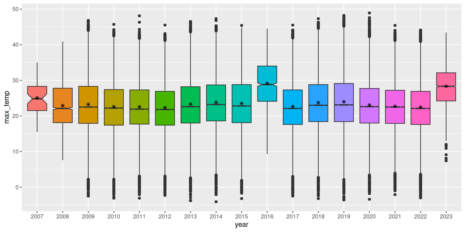
theme(legend.position="none")A box plot, also known as a box and whiskers plot, shows the median (the second quartile) within a box which extends to the first and third quartiles. We note that each quartile delimits one quarter of the dataset and hence the box itself contains half the dataset.
Colour is added simply to improve the visual appeal of the plot rather than to convey new information. Since we include fill= we also turn off the otherwise included legend.
Here we observe the overall change in the maximum temperature over the years. Notice the first and last plots which probably reflect truncated data, providing motivation to confirm this in the data, before making significant statements regarding these observations.
Your donation will support ongoing availability and give you access to the PDF version of this book. Desktop Survival Guides include Data Science, GNU/Linux, and MLHub. Books available on Amazon include Data Mining with Rattle and Essentials of Data Science. Popular open source software includes rattle, wajig, and mlhub. Hosted by Togaware, a pioneer of free and open source software since 1984. Copyright © 1995-2022 Graham.Williams@togaware.com Creative Commons Attribution-ShareAlike 4.0