11.24 Flipped Bar Chart
20200608
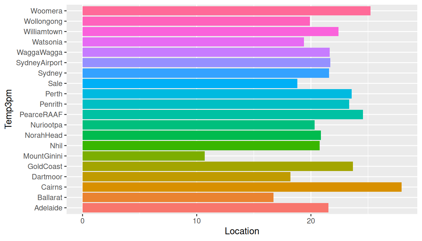
ds %>%
  filter(location %in% (ds$location %>% unique %>% sample(20))) %>%
  ggplot(aes(location, temp_3pm, fill=location)) +
  stat_summary(fun="mean", geom="bar") +
  theme(legend.position="none") +
  labs(x=vnames["temp_3pm"], y=vnames["location"]) +
  coord_flip()
We can flip the coordinates and produce a horizontal histogram as in Figure @ref(fig:ggplot2:mean_temp3pm_location_coord_flip). Note that for clarity of presentation here we have also reduced the number of locations but would note that for an actual data science report we would include full plots. Rotating the plot is a more useful solution than simply rotating the labels as we can then add more bars down the page than we might across the page and it is easier for us to read the labels left to right rather than bottom up.
Your donation will support ongoing development and give you access to the PDF version of the book. Desktop Survival Guides include Data Science, GNU/Linux, and MLHub. Books available on Amazon include Data Mining with Rattle and Essentials of Data Science. Popular open source software includes rattle, wajig, and mlhub. Hosted by Togaware, a pioneer of free and open source software since 1984.
Copyright © 1995-2021 Graham.Williams@togaware.com Creative Commons Attribution-ShareAlike 4.0.